
Website
Bitso Growth Engine
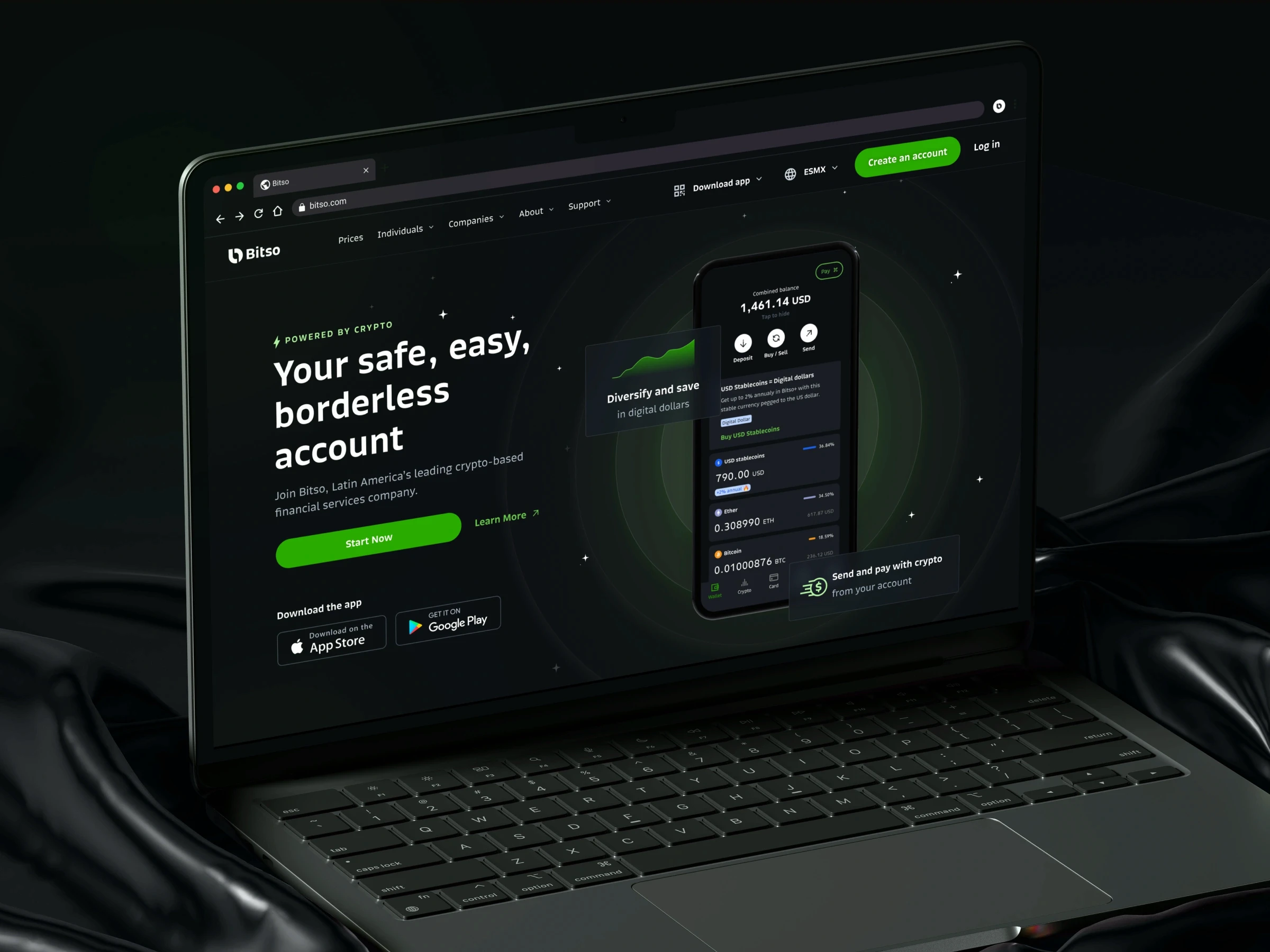
Redesigned Bitso's website into a scalable, localized growth platform doubling conversion from 1% to 2% and driving $60M in new user revenue.
CLIENT
Bitso
SERVICES
Website
INDUSTRY
Finance
COUNTRY
United States & Latin America
Overview
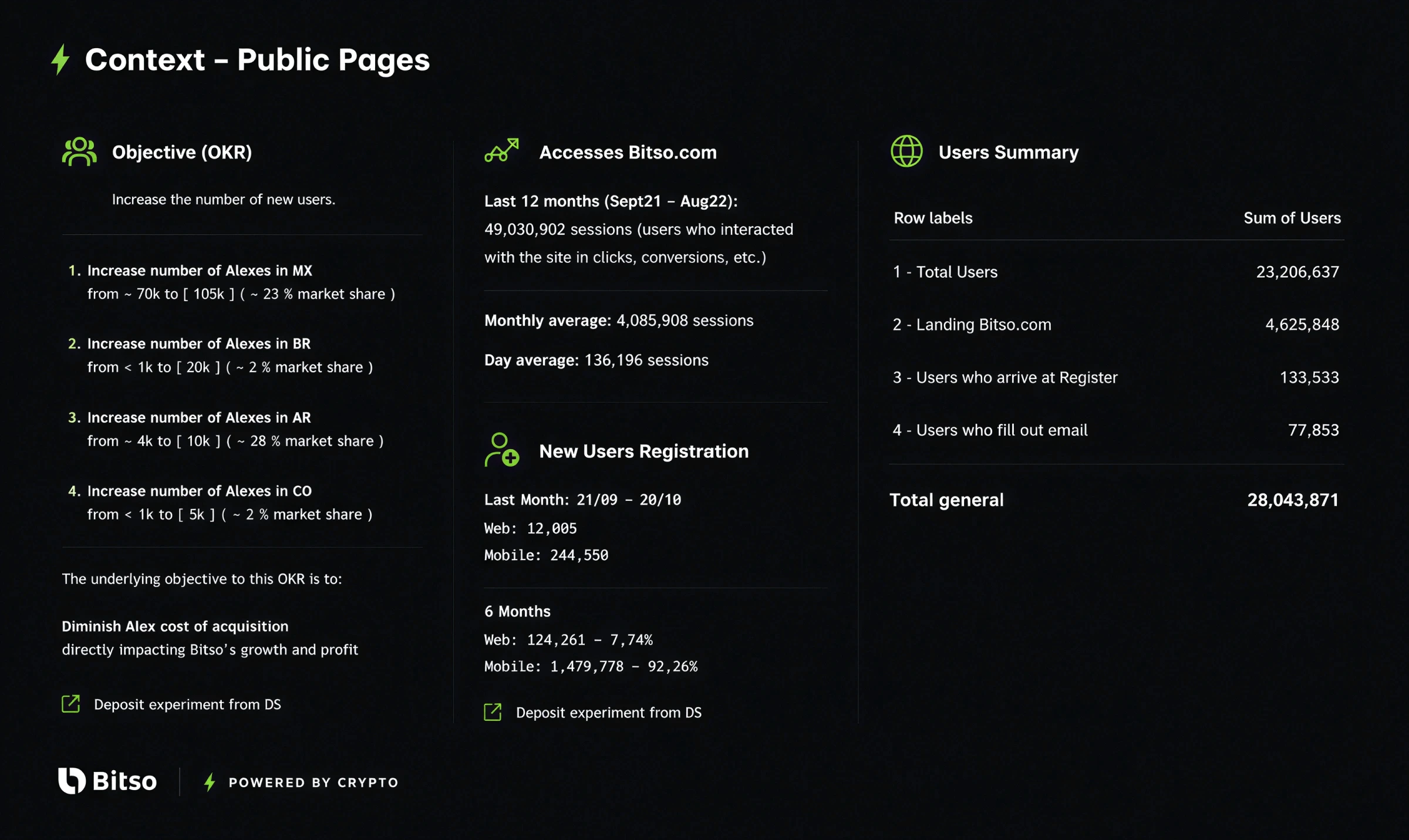
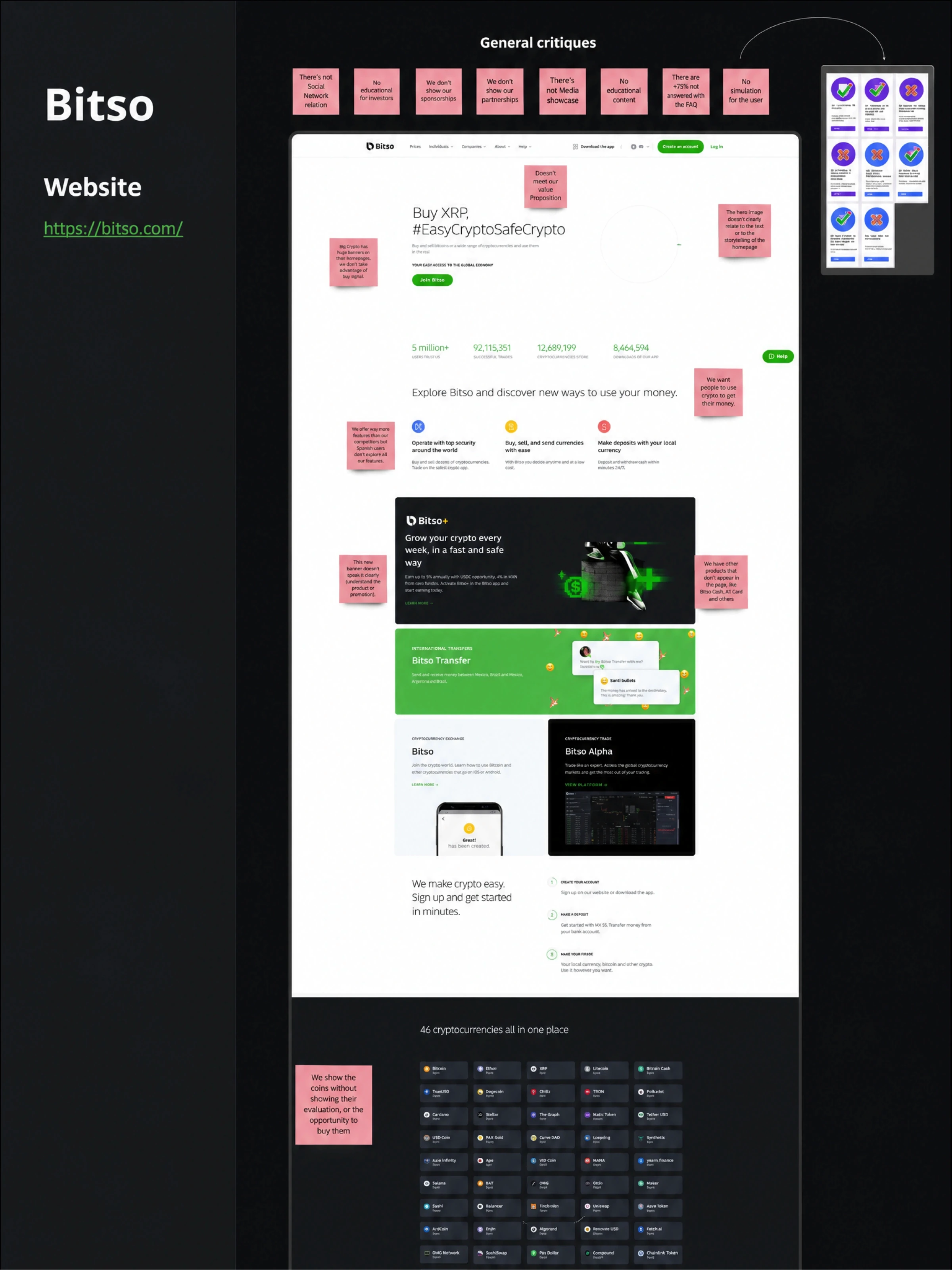
Bitso's website handled 50M+ yearly sessions across Latin America, but a single global homepage was trying to serve fundamentally different markets. Mexico, Brazil, Colombia, and Argentina each had different products, trust barriers, and user maturity levels yet everyone landed on the same page.
The result: a 1% conversion rate and a value proposition that resonated with no one specifically.
Discovery
Quantitative analysis
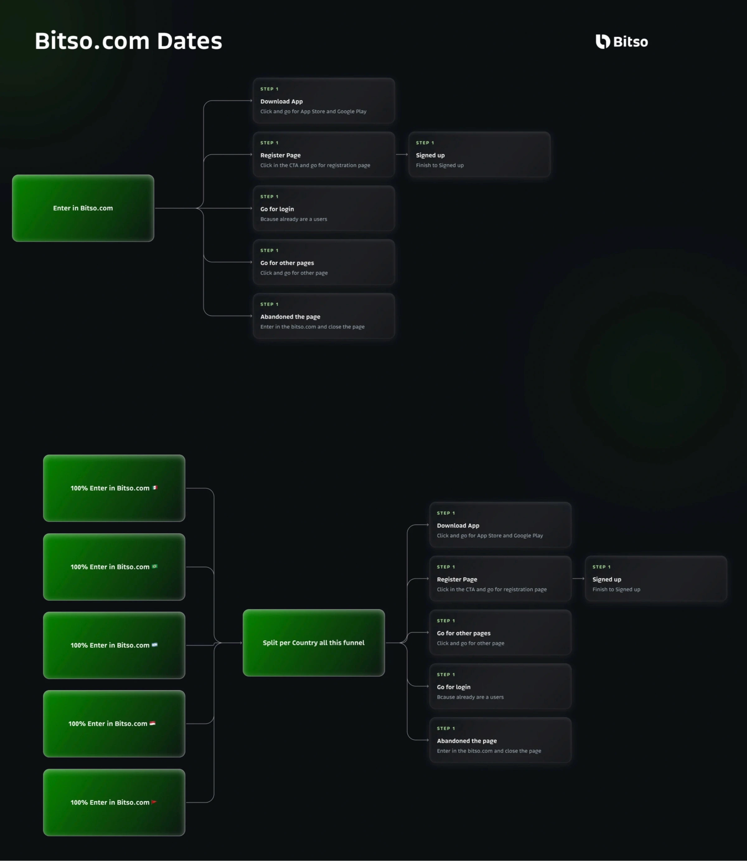
We started with funnel and behavioral data across 4 markets:
68% of new visitors bounced within 8 seconds
42% never scrolled past the first fold
Only 12% of visitors from Brazil interacted with content designed for the Mexican market (which was the default)
Heatmaps showed users scanning for trust signals that didn't exist on the page
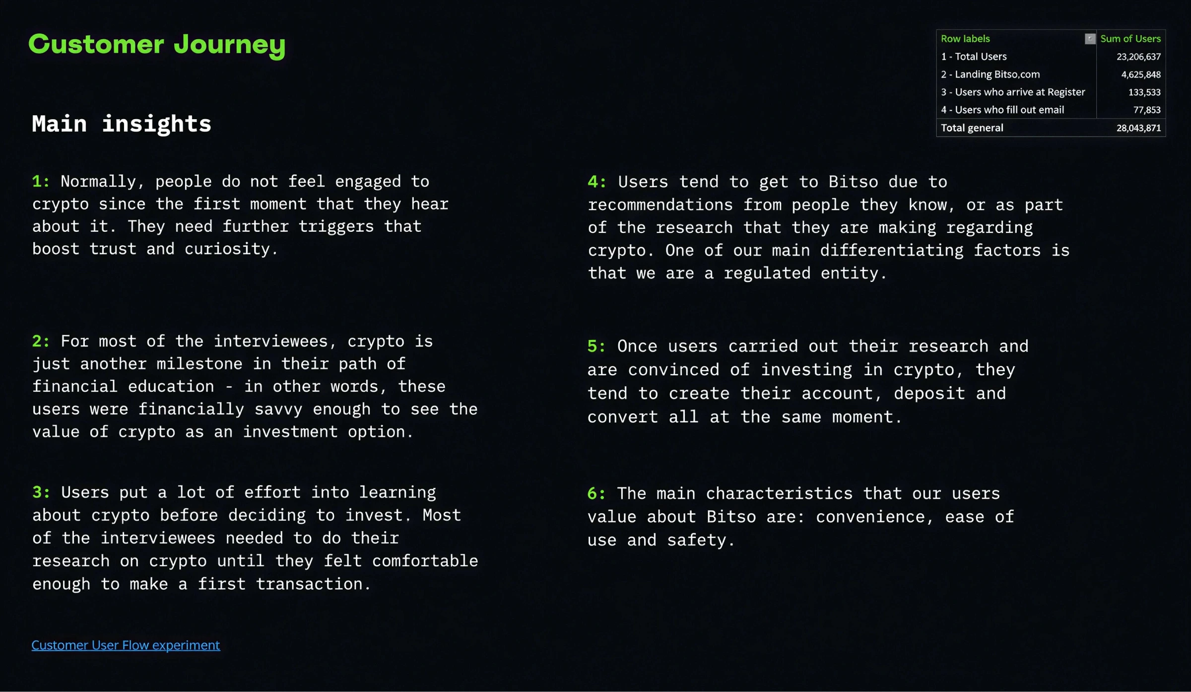
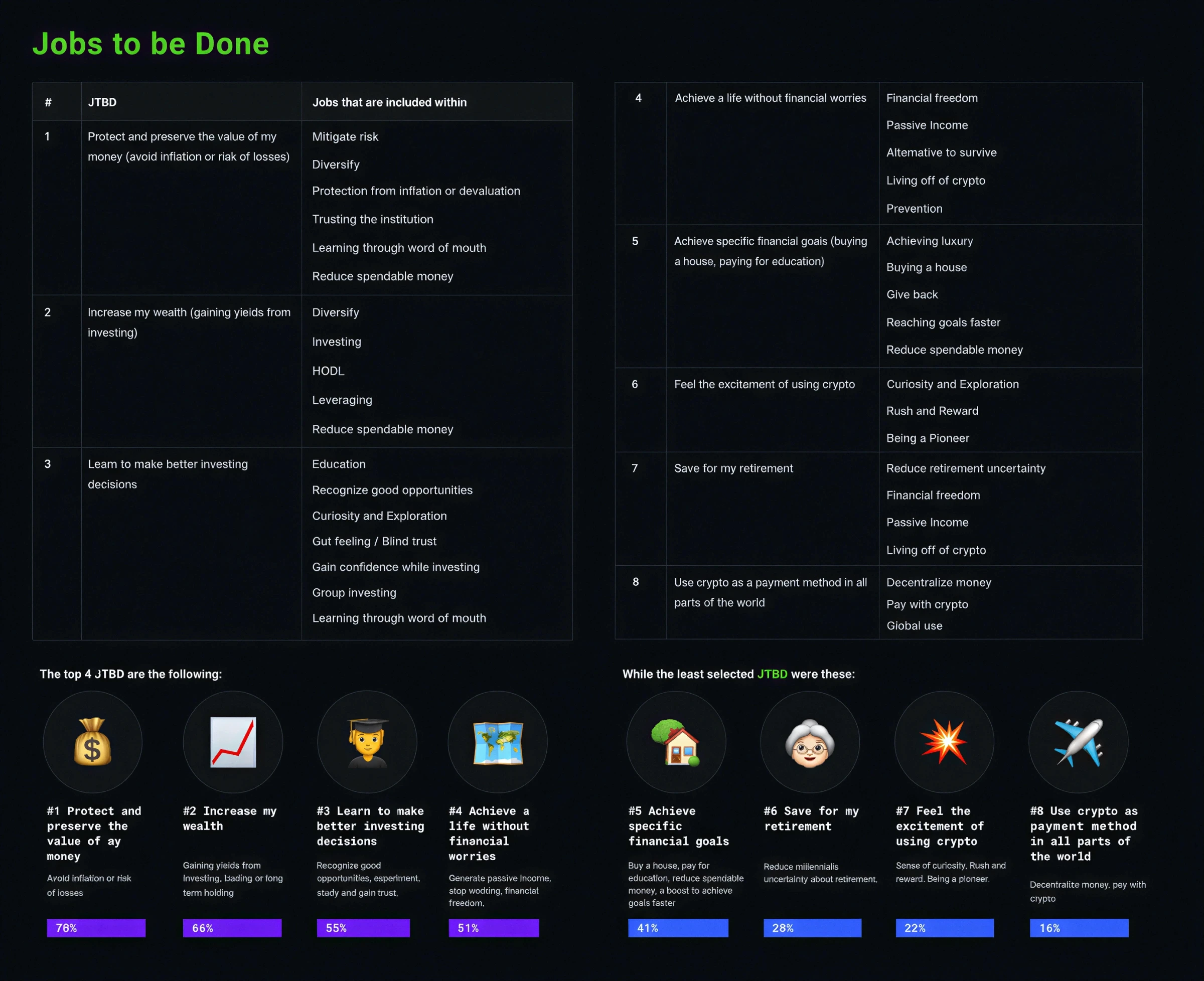
User research (12 interviews, JTBD framework)
We interviewed users across Mexico, Brazil, and Colombia. Three patterns emerged:
"I need to feel safe before I act" — 9 of 12 users mentioned trust as their #1 barrier. They wanted regulation info, social proof, and clear money-back language.
"I don't understand how to start" — 7 of 12 couldn't describe the onboarding steps after visiting the site. The CTA said "Sign up" but users didn't know what happened next.
"This doesn't feel like it's for me" — Brazilian users expected Pix-related language. Colombian users looked for remittance features. The generic messaging felt foreign.
Core insight
Crypto adoption isn't a feature problem it's a trust + clarity problem, and both vary by market.
Strategy
We shifted from one static global page to a modular storytelling system where each market experience could:
Lead with locally relevant value propositions
Address market-specific objections
Guide users through a visible onboarding path
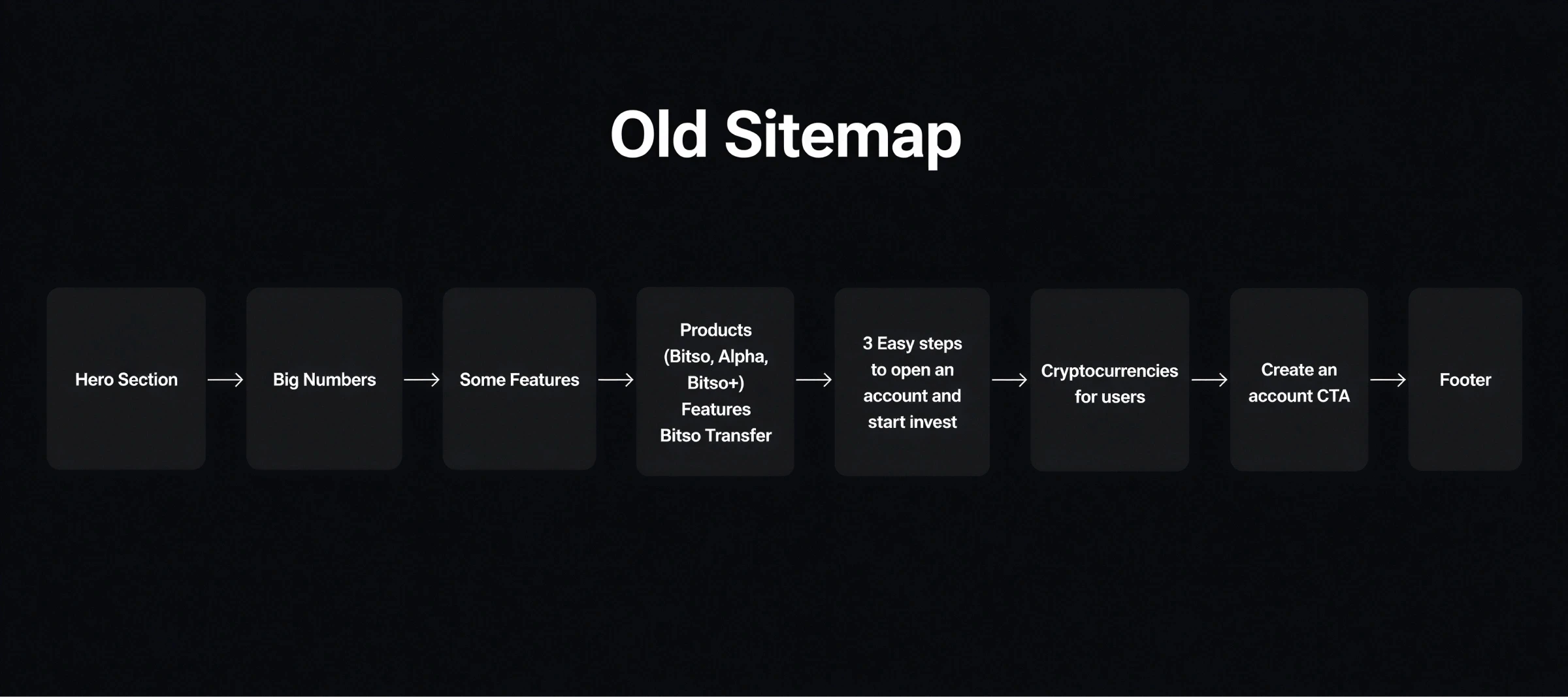
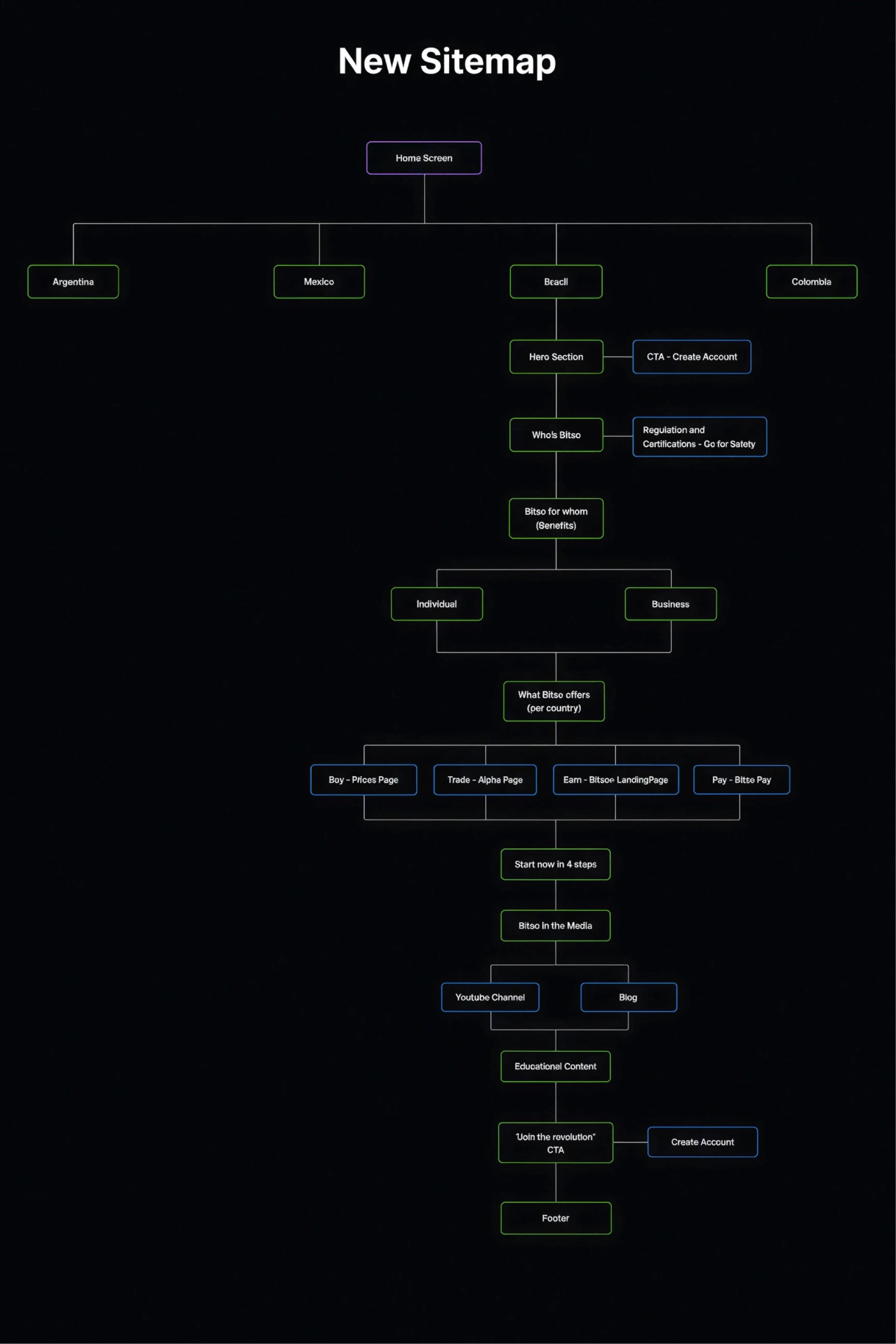
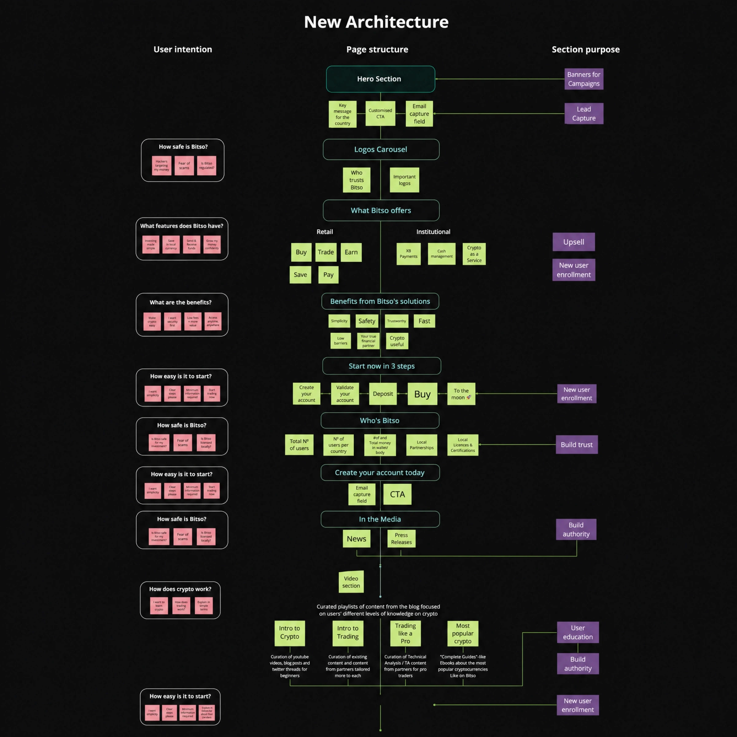
Information architecture (before → after)
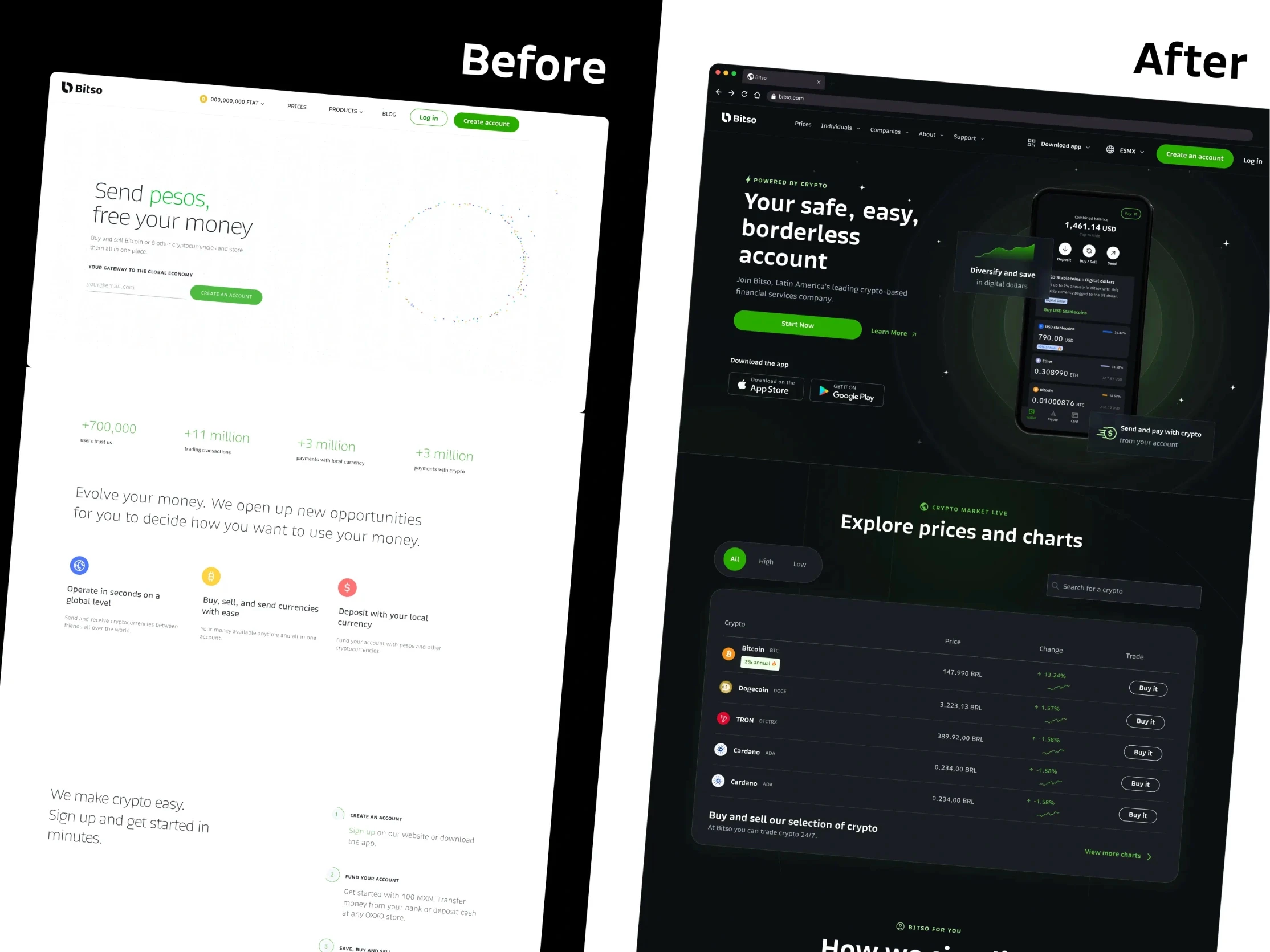
Before: One homepage → generic product list → sign up
After: Localized landing → benefit-driven narrative → trust layer → 3-step onboarding preview → sign up
Design Process
Wireframes & testing
We created 3 structural variants for the homepage and tested them with 45 users (15 per market) using unmoderated Maze tests:
Variant | Scroll depth | CTA clicks | Trust perception (1-5) |
|---|---|---|---|
A — Feature-led | 38% | 4.2% | 2.8 |
B — Story-led | 61% | 6.1% | 3.9 |
C — Trust-first | 54% | 7.3% | 4.4 |
Decision: We combined B's narrative flow with C's trust-first hierarchy — leading with localized social proof, then telling the product story, then converting.
Key design decisions
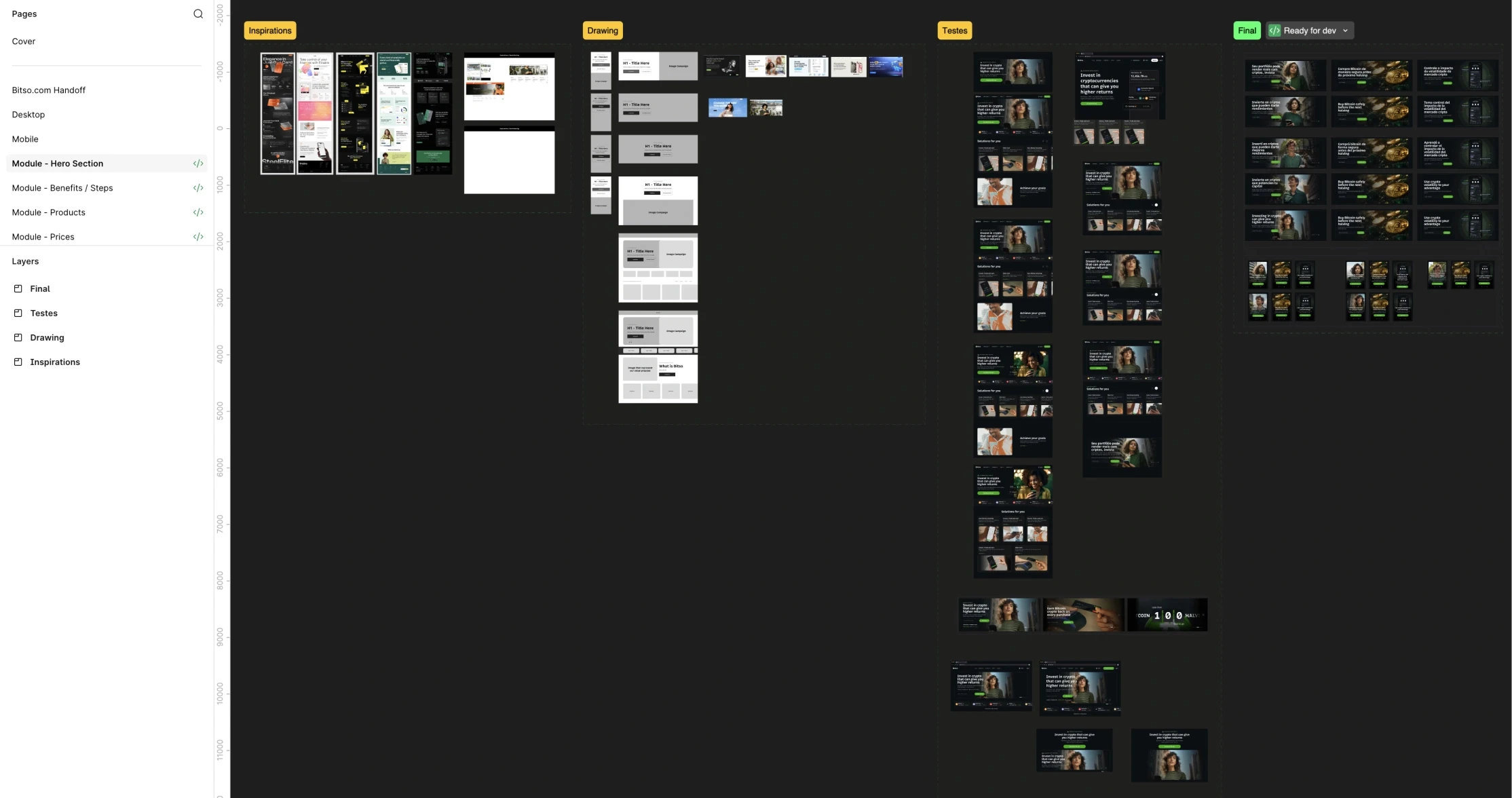
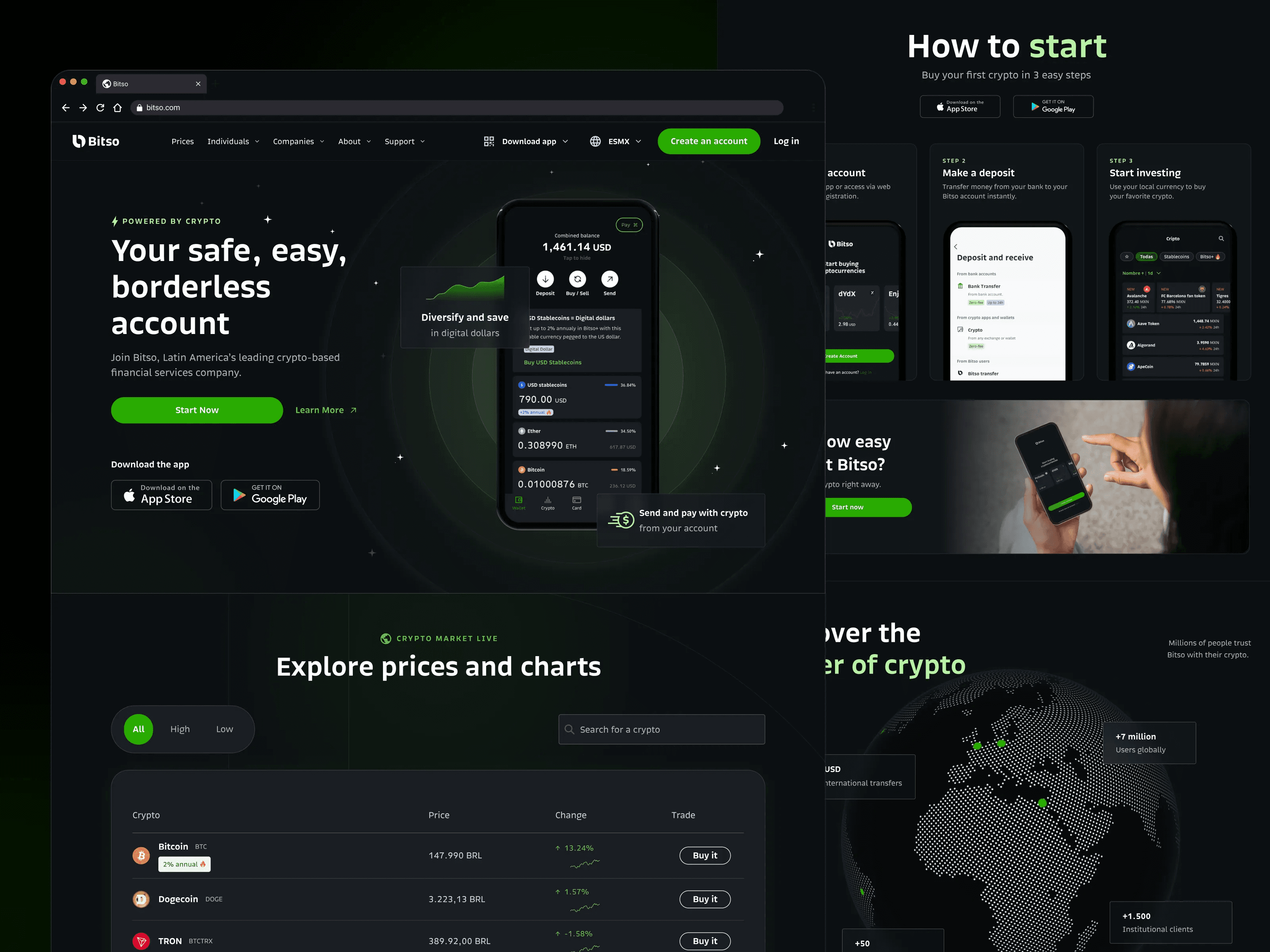
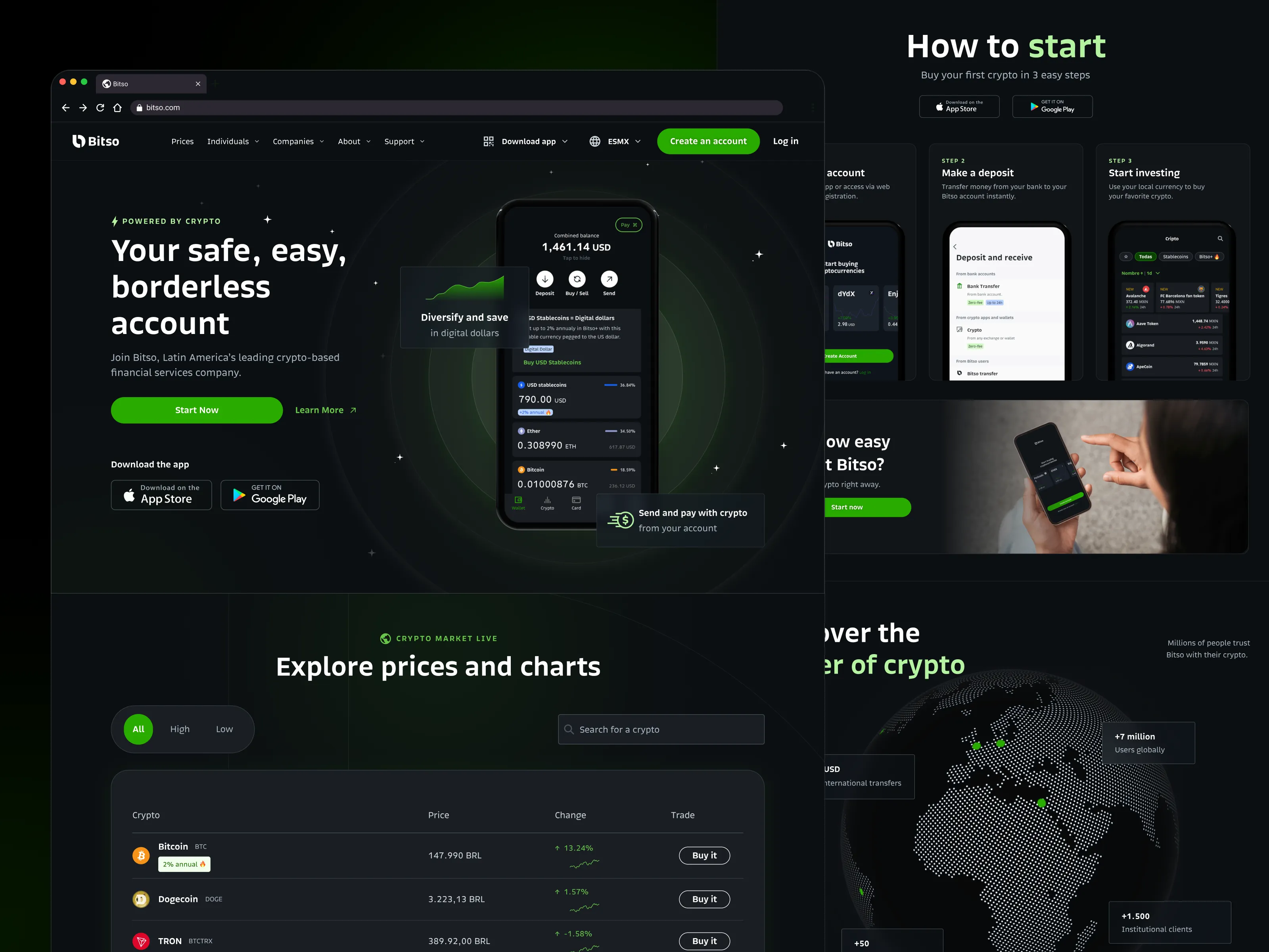
Localized hero sections: Each market got a unique hero with local language, currency, and product focus. Brazil led with Pix. Mexico led with crypto buying. Colombia led with remittances.
3-step onboarding preview: Instead of a blind "Sign up" CTA, we showed a visual 3-step path: Create account → Verify identity → Start with $100 MXN. This reduced the "what happens next" anxiety from research.
Trust bar component: A persistent module showing regulation badges, user count, and transaction volume — localized per country. This single component increased trust perception scores from 2.8 to 4.2 in follow-up tests.
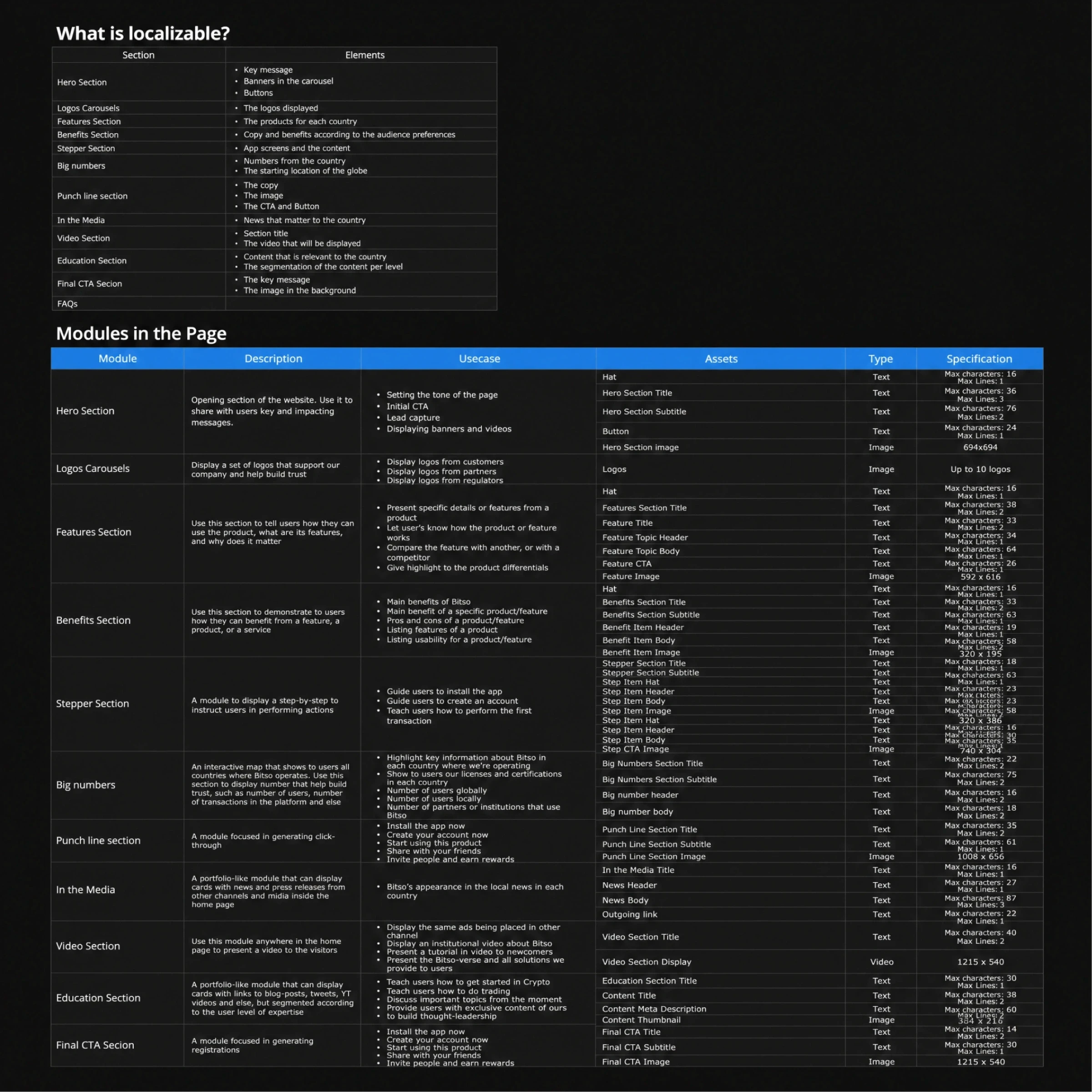
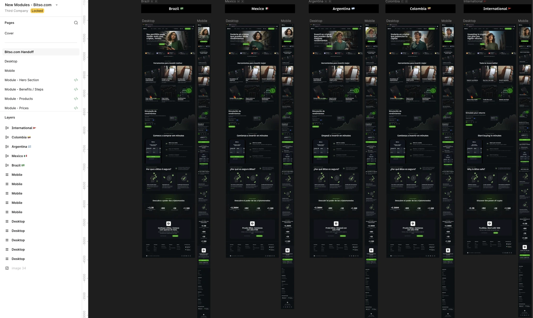
Modular section library: We built 18 reusable content blocks that marketing could assemble per market without engineering support. Each block had defined content slots, responsive behavior, and localization rules.
Design System
The modular system became a growth tool:
18 content blocks with defined variants
4 localized templates (MX, BR, CO, AR)
30+ pages rebuilt using the system
Marketing team could launch a new localized page in 2 days (previously 3 weeks)
Results
Business impact
Metric | Before | After | Change |
|---|---|---|---|
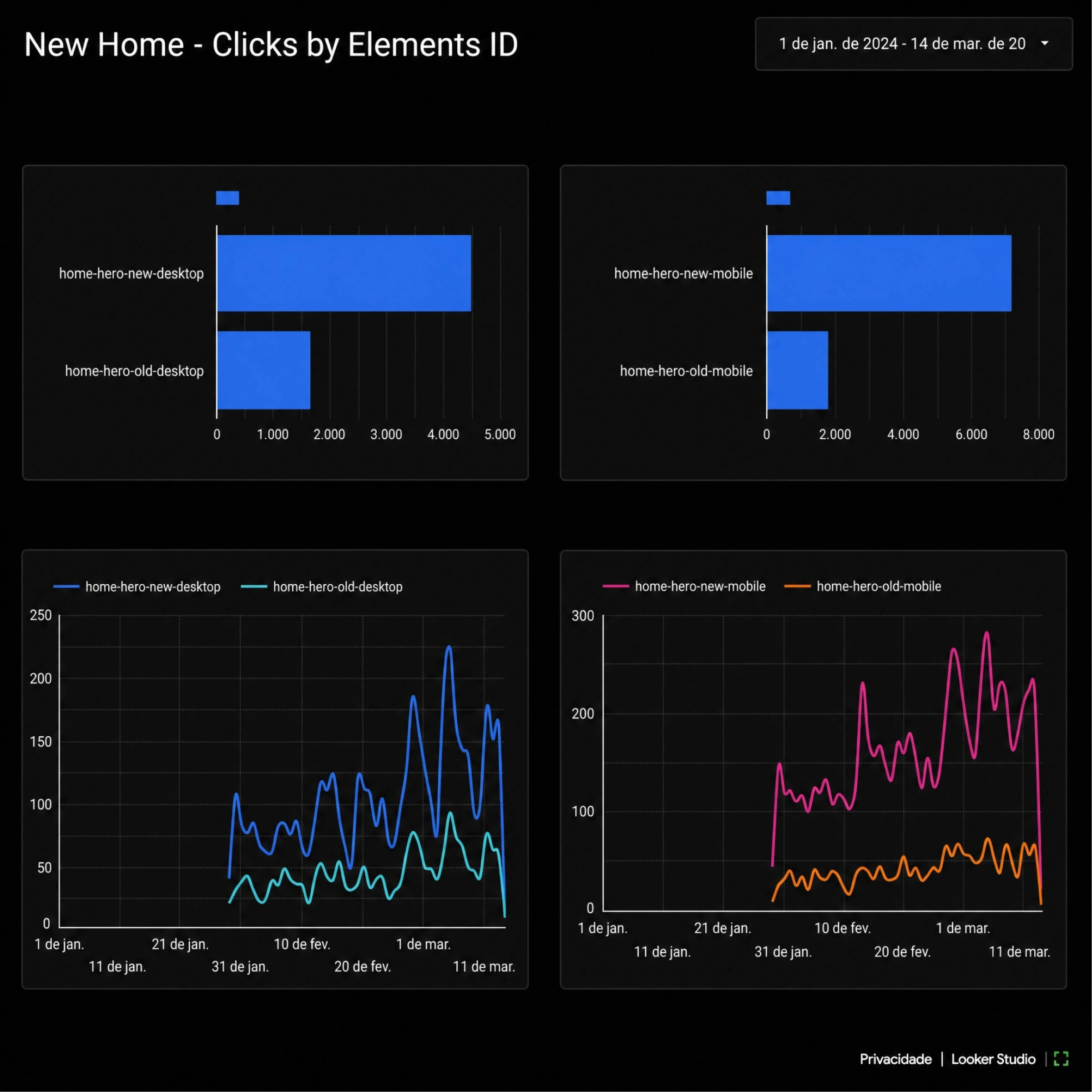
Conversion rate | 1.0% | 2.0% | +100% |
New user revenue | $30M | $60M | +100% |
Bounce rate | 68% | 41% | -40% |
Avg. scroll depth | 42% | 71% | +69% |
Operational impact
Page deployment time: 3 weeks → 2 days
SEO organic traffic: +35% in 6 months
Reduced dependency on engineering for marketing pages
Takeaway
When products differ by market, storytelling must adapt. We didn't redesign a website we built a system that lets the right story reach the right user in the right market.


Let’s build something great
Get in touch
Whether you’re building a new product, improving an existing one, or just want to talk design — I’d love to hear from you. Tell me a bit about your project below.